


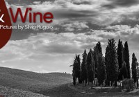
Silvio’s talk on making everything into a picture
This year at BMC Software we have done something really nice, converting the usual development sessions into a Ted Talk format. To exploit this format which forces you into 18 minutes, you really need to know what to say, how to convey your message and what are the key things you want people to remember from your speech.
There's no room to use improvisation if not in very brief moments. For this reason I sat down in my patio, in one of the rare sunny Sunday morning we had in Rome in April, put a nice jazz playlist on and wrote every single word to develop the storyboard I had already created.
Here is the link to the video that has been officially posted on Youtube and, should you be interested, I am also sharing the full text for educational purposes.
Hope you enjoy it 🙂
Quest'anno in BMC abbiamo fatto una cosa davvero carina, convertendo le solite sessioni di sviluppo in un formato Ted Talk. Per ottenere il meglio dal formato che costringe lo speaker a 18 minuti massimo, devi sapere esattamente cosa dire, come veicolare il tuo messaggio e quali sono le cose chiave che l'audience deve portare a casa.
Non c'è spazio per l'improvvisazione, se non in brevi momenti. Per questa ragione, mi sono seduto nel mio patio, in una delle rare domeniche di sole dell'Aprile romano, ho messo una playlist jazz e ho cominciato a scrivere ogni parola per sviluppare il concept e lo storyboard che avevo creato.
Sopra potete anche vedere la registrazione del video che è stata ufficialmente pubblicata su youtube e se siete interessati, condivido anche l'intero testo per uso didattico.
Title
A picture is worth one thousand words. Can you make everything you say into an image?
Abstract
Think, Design, Process and Present your concept in a compelling way.
Every time you have to do or make something in your life, whether it's a simple action, a presentation, an event preparation, a meeting, a dessert, even writing a card for your partner and so on, you have a choice: you can jump to your first step and start doing it or you can think about it before you do so and ask yourself 2 questions: what am I trying to achieve? And... How am I going to maximize my result? Only a few people will get the maximum without thinking first and these are the true talents; but even they can achieve it in some and not all the occasions.
We'll use photography and how an image is thought, taken, processed and presented as a meaning to show you the difference of the two approaches and how you can always find some elements that define greatness in what you're trying to achieve and make it "easier" to maximize the outcome.
Structure
HOW YOU BUILD IT END TO END (From Designing a picture to Photoshop live)
INTRO
• Tell a story (Hook)
• What we will use and why
PICTURE ELEMENTS AND SAMPLES (BAD AND GOOD). SLIDE PPT SAMPLES (GOOD AND BAD) -
CONNECTION:
• VISION AND STORY (PHOTO) – VISION AND STORYBOARD (PRESENTATION)
• DESIGN (PHOTO) - WHERE TO SAY WHAT (PRESENTATION)
• POWER OF SIMPLICITY (PHOTO AND PRESENTATION) - LESS IS MORE
• CARE ABOUT DETAILS (NEVER BE SATISFIED (POST PROCESSING, PHOTO) - ASK THE QUESTION: IS MY INTENT CLEAR OR IS IT HIDDEN?
CONCLUSIONS
TALK
Tell a story (Hook)
Often times we see other people presenting and 9 times to of 10 we get really bored about it… Yes because, to say the truth everybody can talk, lots of people can present, but very few can do it in a way that is fascinating, attractive, inspiring, to the point, without waffling around. Actually, this is exactly what we're trying to do with this Ted conference today and why, in the first place, I loved the idea when Jeff Jeffress shared it with me.
So what is it really that makes such people special in the way they talk, the way they move or the way they prepare and present their artifacts? Well, it's a lot of things and I don't want to oversimplify today as mother nature has a lot to do with it, but there are many things we can really control, learn and assimilate. One of this critical aspects for me is your ability to turn everything you say into a picture. Let me repeat it: It's your ability to turn everything you say into a picture. We all know that there are 2 things that are worth one thousand words. Do you know what these 2 things are? An example or a picture: these are the 2 things that people remember, not million of words. You can spend million of words and weeks of time, but if you aren't good to ACT as an example or to EXPLAIN things so that they are DISPLAYABLE, people will not remember. You can tell your children to not make noise when they eat, but they will do it if you set the wrong example.
Now, you don't always have the luxury to act as an example (because I consider that a powerful privilege and not a duty), so, if you want to be a good communicator, better you start talking the language of visual design, that you understand what makes it work and apply it naturally in everything you do. Easy, right? Well I know it is not, but my challenge today is to excite you so much about it and about the way it is connected to your job to make you go out of this room willing to know more about it and try and try and try until you can actually be a picture and not one thousand words.
What we will use and why
As I can't go with acting as an example, my other choice to replace one thousand words is to use photography, pictures, images. We all have seen great pictures in our lives and we've all seen bad pictures and everything in this range. And if you think about it, we've seen great presenters and bad presenters, and everything in that range… How can we really define what makes something look great so that we can make the process as repetitive as we can?
There are multiple elements that we can consider, but for the sake of today's exercise, we'll stick to the most important four:
SLIDE with the four numbered elements big in the center:
1. DESIGN
2. VISION AND STORY
3. POWER OF SIMPLICITY
4. CARE ABOUT DETAILS
1. DESIGN
Composition rules: Rule of third (Various)/ Simmetry Tre Storie/ break the rules and Surprise effec-Speed
Some pictures work, some others don't. Let's see some examples. Photographers know that there is a famous rule known as the Rule of third. That is putting your subject in the intersection of the lines defining the "thirds" of the frame. When you don't use it, your picture may look static as we have an habit to read from left to right or from right to left, and our eyes like to move. If you put a subject in the middle, your picture is not as powerful (show examples while talking). Your rule can be explicit or more subtle and still be applied and work visually. You have also Simmetry which in some cases work perfectly like a reflection of a mountain in a lake or like in this picture (SHOW TRE STORIE) where everybody asks "Did you stage that or is it a candid?". Or this other (SHOW GATE TO HEAVEN). Now the reason why we have rules is because when you master them, you know when to break them 😉 SHOW DUOMO DI MILANO, SHOW SPEED. The surprise element is what you need to put in your game. If we all stick to the rules, then everything becomes boring :-))) In this picture all the rules are screwed, but the picture works and surprises the viewer as the real subject gets less imprtance than other distracting design elements and they all fight to get the attention of the viewer. If you learn how to surprise, people will remember what you do.
Lines: Speed
This leads me to talk about design elements like Lines. You can see here that I used lines as a main design element and the picture is thought to be like that. Or in this other example from Tuscany SHOW LINES OF CYPRESSUSES. So lines are important and they are the main thing the eye is looking for: explicit or implicit lines. When you build a powerpoint slide, you may want to include lines that drive the viewer. Show ROADS TO CLOUD as ppt example of lines.
Patterns: Paris tables
Lines bring us to another design element which is very used and pleasant to the observer. SHOW Paris Tables. We're talking about patterns. Patterns are powerful as they help you build a visual consistency and the "imitate" what we see in Nature. Show MACRO of Patterns. That's why the human eye likes pattern. You can do the same in a Powerpoint slide. SHOW EXAMPLE. And Actually, we use patterns so that we can either show consistency or break the consistency to make the break evident.
Color: Burano/Acitrezza
Color (or its absence) is a design element as well. We may decide to use it as a main vehicle in our picture. Warm color will bring a dynamic exciting message, while cold colors (blue/green) SHOW ACITREZZA, will bring serenity, calm to the observer. If you want to calm down an angry customer you may want to go for the latter 🙂 and have lots of blue and green ppt slides that say nothing. At the end you'll have a deal.
But, as I said, even the absence of color is used as a message. And it is all tied to our culture, our history, what our eyes are used to see and so on. If you've grown up with color, black and white will give you an intimate, evocative, emotional feeling as long as you play well with the last element will talk about.
Contrast:
SHOW SCANNO. Contrast is very powerful as you can see. You can almost feel the silence in this picture from Scanno, an old small town in Abruzzo, Italy.
Now, every single one of the elements we discussed are powerful to put accent on some messages you're saying and if you're aware of them and you master their usage, you can amplify your message and make it a loud shout or you can make it subtle but powerful. It's up to you.
BUT TO AMPLIFY A MESSAGE, YOU HAVE TO HAVE ONE! SO Here we go to point number 2 (SHOW SLIDE WITH 4 POINTS AGAIN)
2. VISION AND STORY
Content/Subject: Tell a story (Bench) - Dear John
What do I mean by Vision and Story? You've got to know what you want to say, and you've got to know it first thing. Yes, it can be a rough idea at the beginning, but if you don't know the end, your story will not be clear. Expert photographers don't talk about shooting a picture, they rather say "making a picture" and the reason is exactly the power of the vision. You make a picture to achieve your vision. The camera is just a meaning as "There always 2 people in a photograph: the photographer and the viewer" as Ansel Adams said. And the same applies to everything we do as communicators. When I drove to Piazza del Popolo in Rome I had a subject in mind: a bench. I thought, if I am a bench in Piazza del Popolo I see an incredible amount of life passing through. SHOW PICTURES OF THE BENCH. What if I could witness what the bench is seeing and make the bench an observing character in the picture rather than a passive subject. It would make the bench the only constant. How do I do it? The only way was to stand still in the same place and interact with lite. I wanted to be the bench itself, I had to feel as a bench.
The first picture I stumbled upon was this SHOW ROMANCE
So when you look at a picture like that you feel like, nice picture, let's analyze it it shows Romance and you tell a story, and let's see the design elements: lines, curves, composition, color, … and it but that's it. But if I look at this other one, same bench, 5 minutes later, same hence, … well the emotional content is completely different. SHOW INCOMMUNICADO. And if I start looking at it presented all together, I can really have my story built and we're just talking about a bench. And this is the queen picture of the day… It is where I decided to actually really feel the bench and after asking myself how to do it, I asked myself: "What if my girlfriend just left me with a letter. She gave me a Dear John". (SHOW Dear John). That's the title of this picture, Dear John, and it is what photographers call a Storytelling picture with a storytelling aperture. The couple in the background is a bonus element which is not staged obviously. Sometimes you need to be lucky…
To build your story, there's no other way than starting with the end in mind, defining the key points and then developing it. It's that top-down approach that makes your message strong. So you know what you can use as design elements, you know what you want you want to say or convey as a message.
Now that we talked about things you can put in your message, I'll now go to the opposite extreme and talk about the POWER OF SIMPLICITY (SHOW THE SLIDE WITH THE 4 POINTS). This means you start removing things...
3. POWER OF SIMPLICITY
What does simplicity mean? Simplicity means that Less is more. SHOW examples of use of negative space (ST. PETER, BARCELLONA). In Photography and visual arts it works in the same way as in presentations. If you don't know why you're including an element… EXCLUDE IT. It will only make things look cumbersome. SHOW EXAMPLES OF A SLIDE WITH A STRONG MESSAGE AND HOW IT COULD BE MESSED UP in the wrong belief that putting more things will make you look and sound more credible… SHOW GIULIA'S EYE
Think about this if ideally you could put only one thing on your screen, there would be no room for misunderstanding. SHOW ELENA SLEEPING. JOKE ON THE UNDERLYING MESSAGE.
And at last I want to talk about the details. That's where the devil is. You can have a great idea, a great message, but if you don't review it, if you don't test it, if you don't ask yourself "What's the best way to bring it to destination, you are going miss a key opportunity. SHOW THE SLIDE WITH THE 4 POINTS
4. CARE ABOUT DETAILS
In our world, we are so fast and stuck to habits that we forget the details. We don't ask ourselves if our original intent is clear or if it's hidden and if we chose the right medium as a company for our talk. Do I really need slides or a piece of laminated paper is better given the audience. Do I go with drawing something live or should I use an IPAD app? We seldomly do this and we end-up losing the wow effect.
SHOW Some PPT examples of how the same concept can be put in different ways.
Let me finish with one example of why details are important. If I stopped at vision here I would have had good pictures, but working on the details brings me to great pictures.
SHOW THE EYE BEFORE RETOUCHING. GET THERE
CONCLUSIONS
It's a powerful thing isn't it? Things had a shape and a visual appearance well before we started to use words as human beings on this planet. That's why it's so strong.
That's why who can describe things, even with words and hands, in a way that appears as if they're describing a picture, is such a great communicator. There are incredible body language trainings and so on out there, but listen to me:
It's all about making everything you say into an image. LEAVE THE SENTENCE ON THE SCREEN
I want to leave you with 2 short stories
About 2 years ago I turned 40 and I had my first exhibition during my birthday in a very nice gallery in Rome and this was like turning an old dream into reality and draw a line on everything I had done till that moment. Lots of people attended and lots of them left a message on the guestbook, but there is one from an Artist that gave me something special. He went around the ground floor and first floor and observed everything. Then he took the pen and wrote: "Lots of people can make noise, very few can make silence, Silvio can photograph it". Well after you read books and shoot pictures for a lifetime you get a comment like that and it's eye opening on the fact that you can touch incredible feelings with what you do and what you say. 2 weeks ago I get a message from one of my presages guys that says: Silvio I want to thank you, Matt and Dave for believing in me. You made my parents proud of me as I just made an offer for a house and this is my dream becoming true.
What I want to say is that no matter how much you study and work, if you have a purpose and you're honest about it, people you communicate with will feel it. It's the passion you have in you that will make everything you do look as a clear picture.

Recent Posts


- Comments
Click on a tab to select how you'd like to leave your comment
- Silvio Rugolo Fine Art Photography


